WONDER>FIT 是成立于2016年坐落于浙江台州的健身房,经过6年的精心运营,在当地收获了一系列忠实用户与不俗的口碑,品牌主理人因此在2021年末决定推出一间全新的门店作为旗舰店并以将原品牌转变为生活方式品牌作为目标进行迭代升级,以“健康生活新概念”、“运动与咖啡空间融合”和“精准方案”三个概念为核心打造为运动与生活提供更多可能的全新场景,让爱运动的用户能够更优质的沉浸在身体细微改变得愉悦之中。
WONDER>FIT is a gym established in 2016 in Taizhou, Zhejiang. After 6 years of careful operation, it has gained a series of loyal users and a good reputation in the local area. The brand manager therefore decided to launch a new space as the flagship store at the end of 2021 and to transform the original brand into a lifestyle brand as the goal of the brand refresh, with "New Lifestyle", "Fitness x Coffee" and "Accurate Solution" as the core to provide more possibilities for sports and life, so that users who love sports can be more quality engaged.


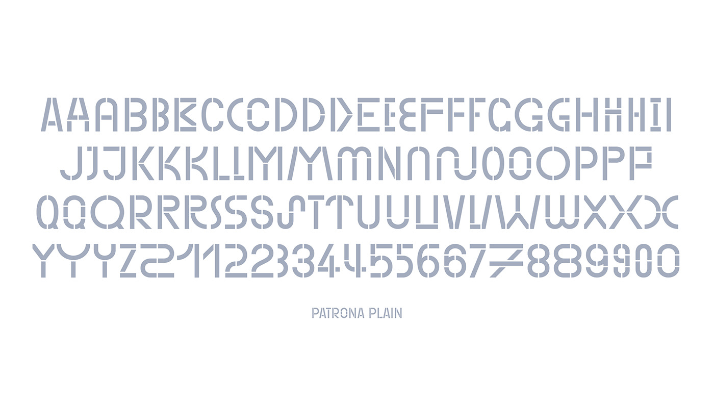
WONDER>FIT全新的视觉识别形象以stencil(透字板)风格的字型为基础,源自品牌原标识中就一直存在的stencil风格的字标。在品牌标识中,我们将字标设计得更加轻盈与现代,同时在WONDER与FIT之间增加一个三角箭头符号,一方面在阅读层面上使LOGO本身即成为一个简洁且清晰的品牌口号——想要更健康,拥有一种向前的动力;另一方面,我们相信WONDER>FIT自身的性质决定了其空间体验将会是消费者对其品牌建立印象与连接的重要所在,因此新标识中增加的箭头与品牌整体设定蓝色也呼应了旗舰店空间设计中出现的一系列三角符号与空间装饰的色彩,使品牌印象更加连贯。
The new visual identity of WONDER>FIT is based on the stencil style typeface, which is derived from the stencil style wordmark that has always existed in the brand's original logo. In the brand identity, we designed the wordmark to be lighter and modern, and at the same time added a triangular arrow symbol between WONDER and FIT. On the one hand, the LOGO itself becomes a concise and clear brand slogan in terms of reading – To be healthier, and it has a forward momentum; on the other hand, we believe that the nature of WONDER>FIT determines that its spatial experience will be an important part of consumers' impression and connection with the brand, so the arrow and the overall blue color also echo a series of triangular symbols and the colors of space decoration in the space design of the flagship store, making the brand impression more coherent.